The Future of Typography: Trends That Will Define the Web
Typography isn’t just about fonts. It shapes how users interact with your brand.

Typography gives digital products their voice. It establishes hierarchy, shapes reading rhythm and communicates personality before a visitor has absorbed the full message.
The most useful typography trends are not isolated font choices. They are changes in how type behaves across screens, how it responds to content and how clearly it helps people move through an interface.
Large type needs editorial discipline
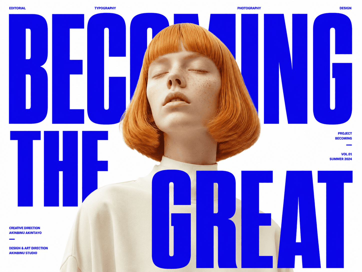
Oversized headlines can create an immediate point of view and make a simple layout feel distinctive. Their impact depends on careful line breaks, measured spacing and supporting copy that does not compete for attention.
Scale should follow meaning. If every heading is enormous, hierarchy disappears. A dramatic display size works best when quieter elements give it room and lead the reader naturally into the page.
Responsive type is more than shrinking
A desktop headline cannot simply become a smaller version of itself on mobile. The available width changes its rhythm, line count and relationship to the content below it. Responsive typography needs deliberate sizes, line heights and maximum widths at each important breakpoint.
Fluid sizing can help between breakpoints, but it still needs boundaries. Without a sensible minimum and maximum, type can become cramped on small screens or overpower the composition on wide ones.
Body copy still carries the experience
Expressive display type attracts attention, but body text does most of the communication. Comfortable line length, clear paragraph spacing and enough contrast make the difference between content that looks polished and content people can actually read.
Dense pages benefit from predictable rhythm. Repeated spacing and consistent heading levels help visitors scan, pause and return to the right place without losing context.
Variable fonts can make a system more flexible
A variable font can offer a continuous range of weight, width or optical adjustments within one family. Used carefully, those controls help a type system respond to different sizes and layouts without collecting many unrelated font files.
More control does not mean every axis needs to animate. Typography should remain stable while people read. Motion is most useful when it supports a purposeful transition or a short expressive moment.
Pair fonts by role
A pairing works when each typeface has a clear responsibility. One may carry expressive headings while the other handles longer reading, navigation and labels. Contrast in proportion or texture can add character, but the pair still needs to feel like one system.
Build the type system before the pages
- Define display, section, body, label and utility roles.
- Set line height and width alongside font size.
- Test real long and short content at every breakpoint.
- Include hover, focus and validation states in the system.
- Keep the number of styles small enough to remain consistent.
The future of web typography is not one visual trend. It is a more responsive and intentional relationship between voice, content and interface. When the type system is clear, every page communicates with greater confidence.
Related services
- UI/UX & product design
Interface and experience design for websites, web applications and digital products, including flows, design systems, prototypes and motion.
Let’s keep in touch.
Follow me on LinkedIn and X for more on thoughtful, high performance web design and digital craft.